Multi-Brand Platform
Building a White-Label Reseller Platform for Web Agencies
Role
UX/UI Designer
Timeframe
7.5 months
Impact
First-100-Customers milestone reached
Team
Product Manager
Project Manager
Business Analyst
Front-End Engineer
Back-End Engineers
Problem
One Console, Many Brands
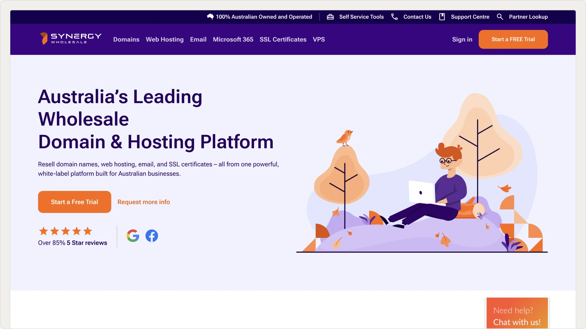
Synergy Wholesale customers are web agencies who resell domains, hosting, email, and SSL under their own brand. Every one of those agencies needed the tools for Domain Management, Billing, Service Configuration and Support, but there was no single solution to help them streamline these processes.
Discovery
Three Audiences, One Flow
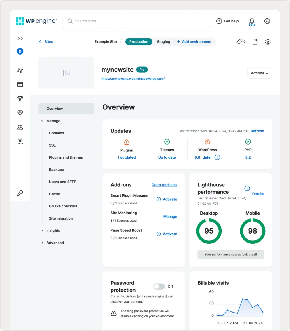
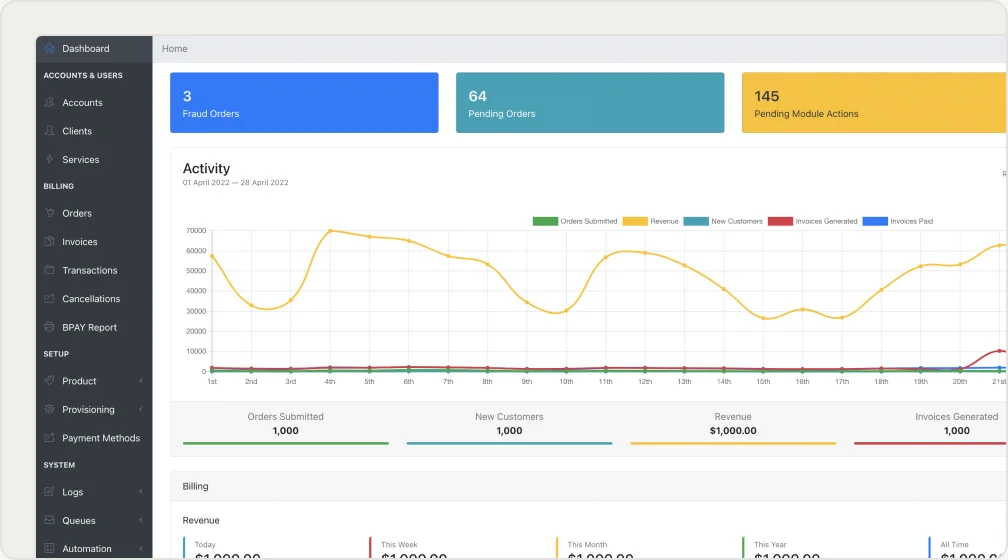
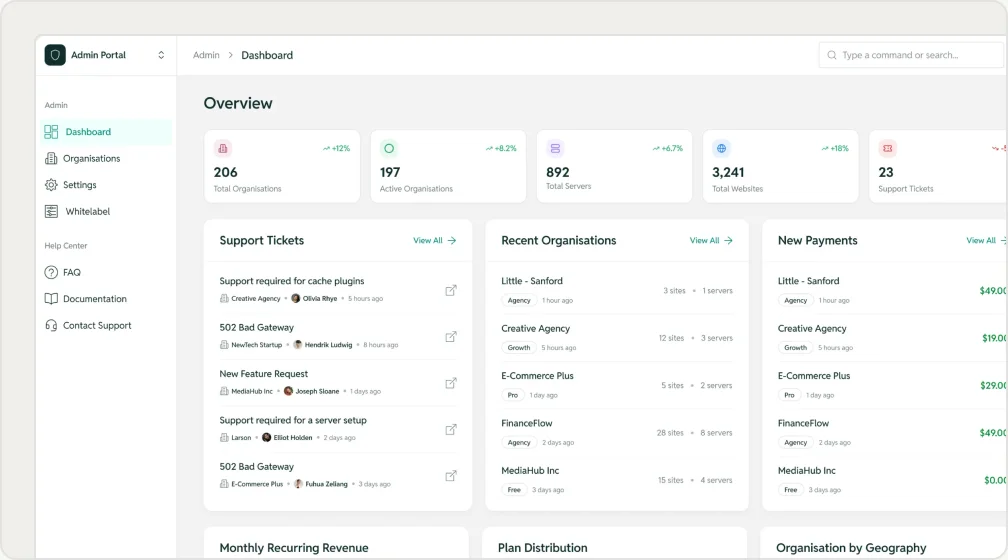
Synergy Wholesale customers were exclusively Australia & New Zealand based, so category benchmarking was run against reseller platforms serving that audience. I ran moderated usability testing with 8-12 SME customers, testing both the reseller admin view and the end-customer portal separately. Findings were synthesised into the PRD.
Ideation & Concepting
Segmenting Without Fragmenting
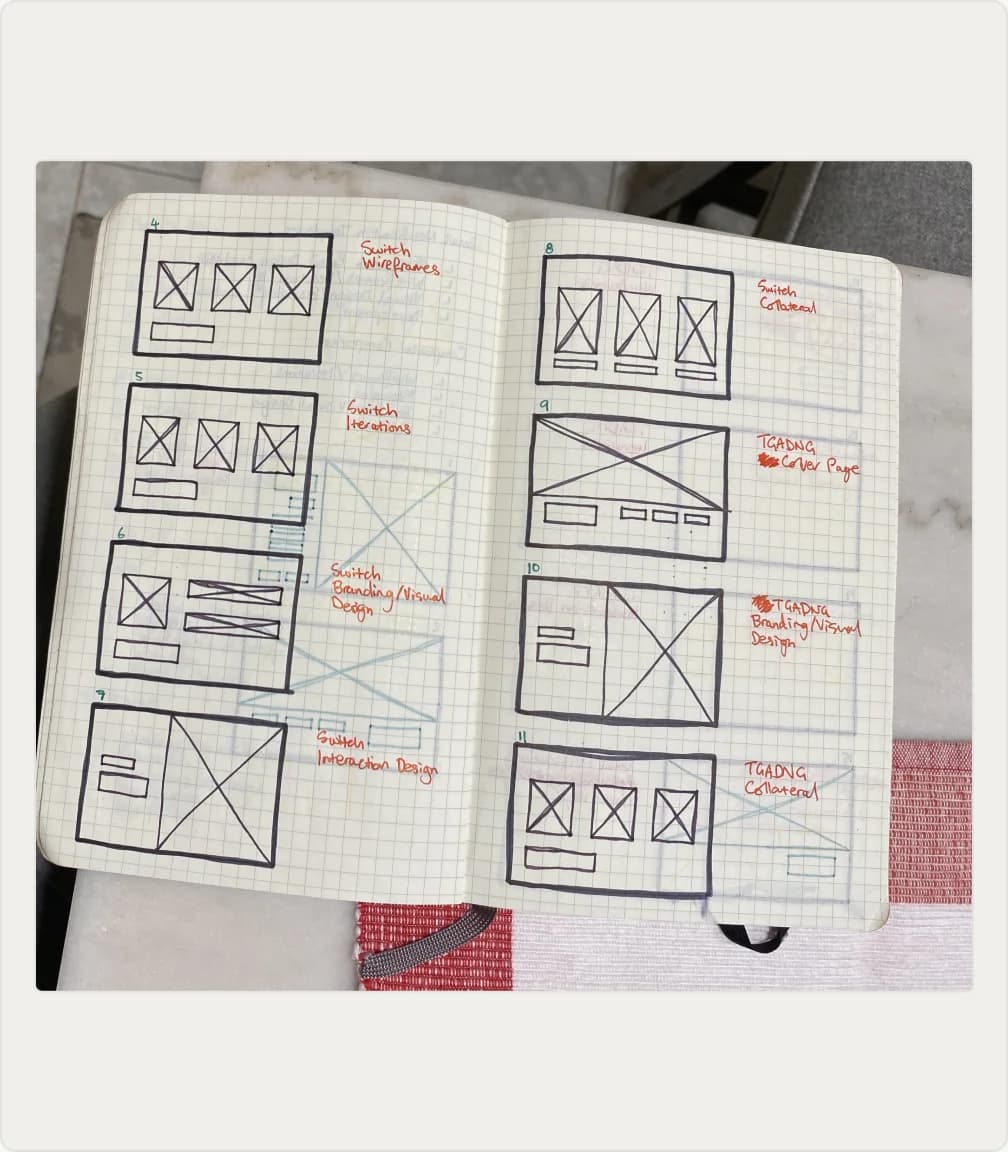
With three very different audiences sharing one console, the early sketches focused on serving all of them without splitting the product into three. I worked through flows on the whiteboard with the PM and BA, landing on segmented journeys: guided defaults and deferred sign-up for first-time buyers, and faster, denser paths for technical users who already knew what they wanted.
Early Prototypes
Two User Profiles, Two Unique Use-Cases
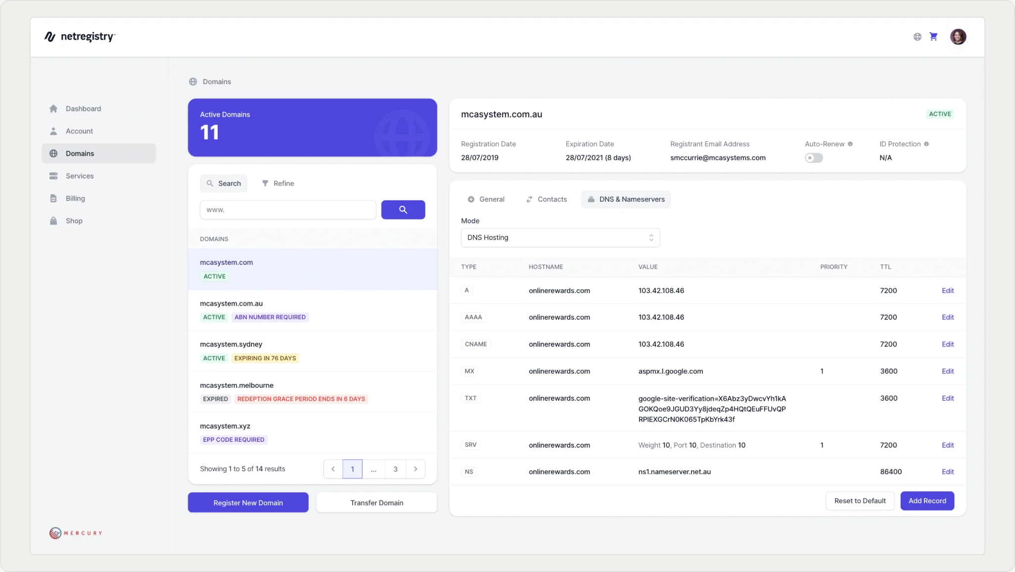
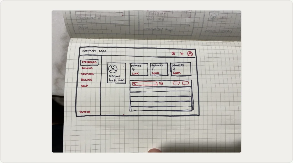
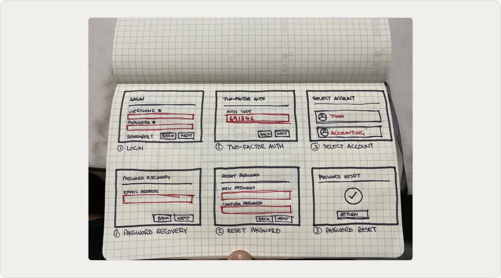
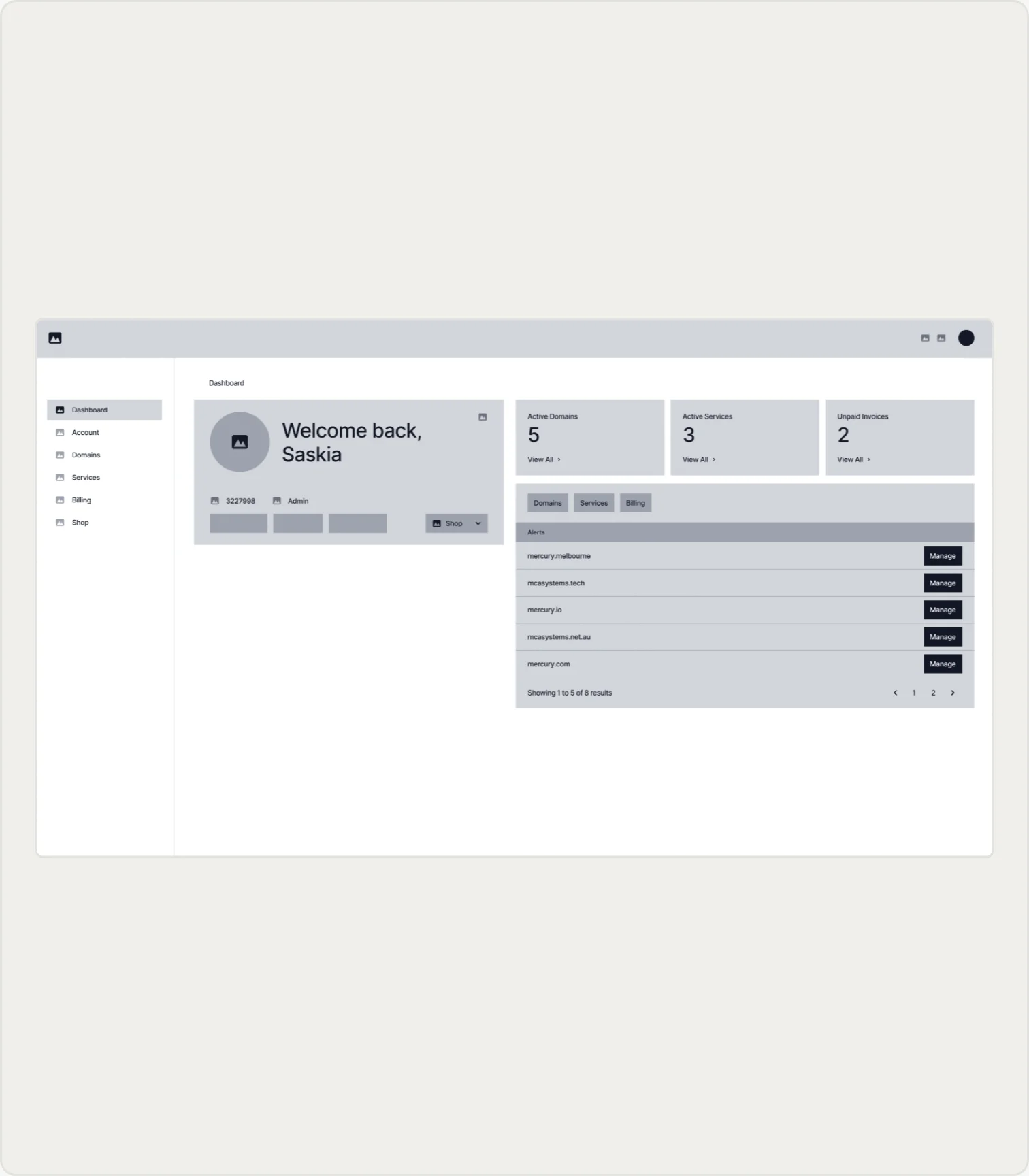
The PRD asked for two variations of the interface – one for the reseller managing their portfolio of domains and services, and one for the reseller's own end customers managing a single account. Prototypes were developed for testing with Synergy Wholesale customers, and the findings surfaced behavioural patterns that informed the design.
Visual Design & Componentry
Tokens That Re-Brand Themselves
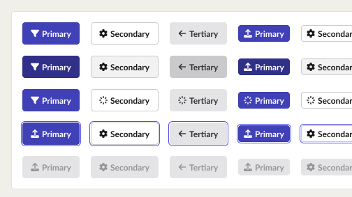
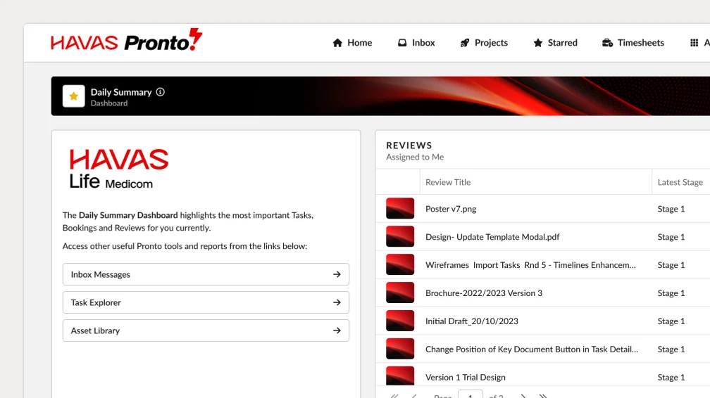
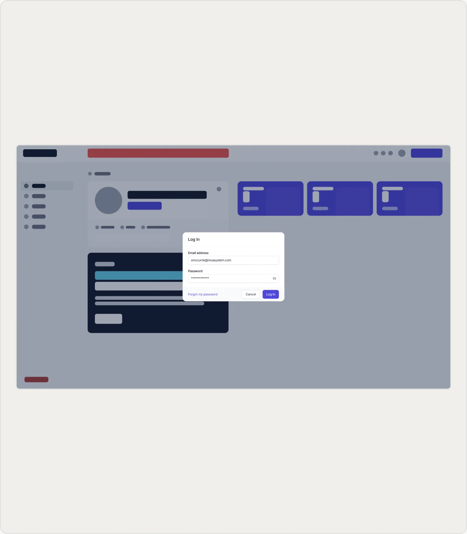
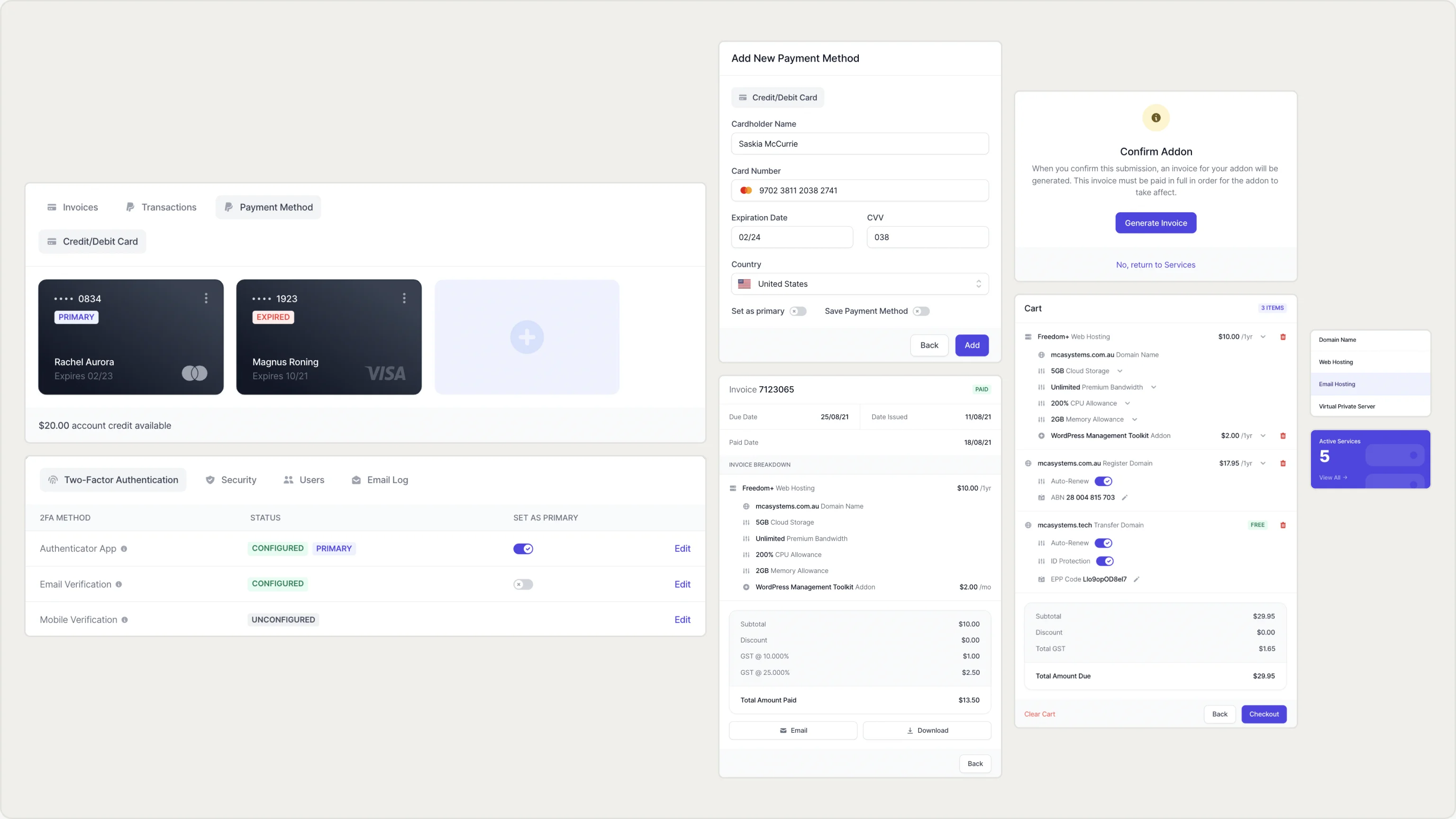
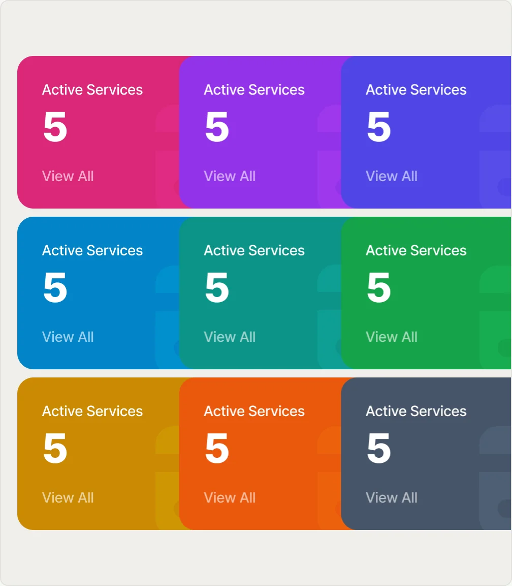
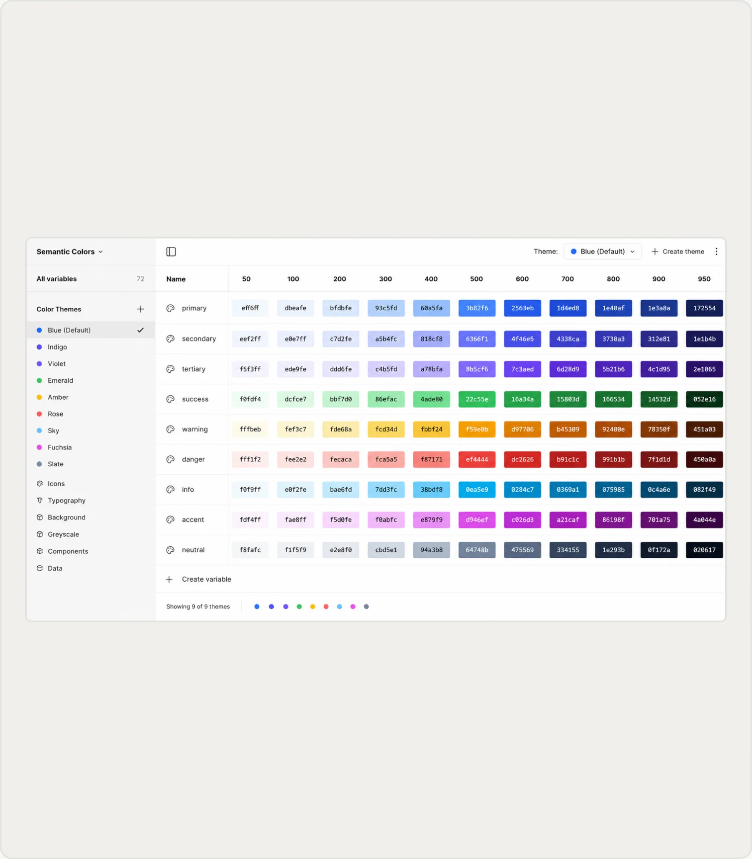
Every screen was built from one shared component set, with brand identity living only in the tokens. Using Figma Variables and Modes, switching brands swapped colours at the semantic layer while layout, spacing and behaviour stayed untouched. A new reseller brand became a configuration change rather than a redesign, and every brand picked up fixes to the shared components automatically.
User Flows
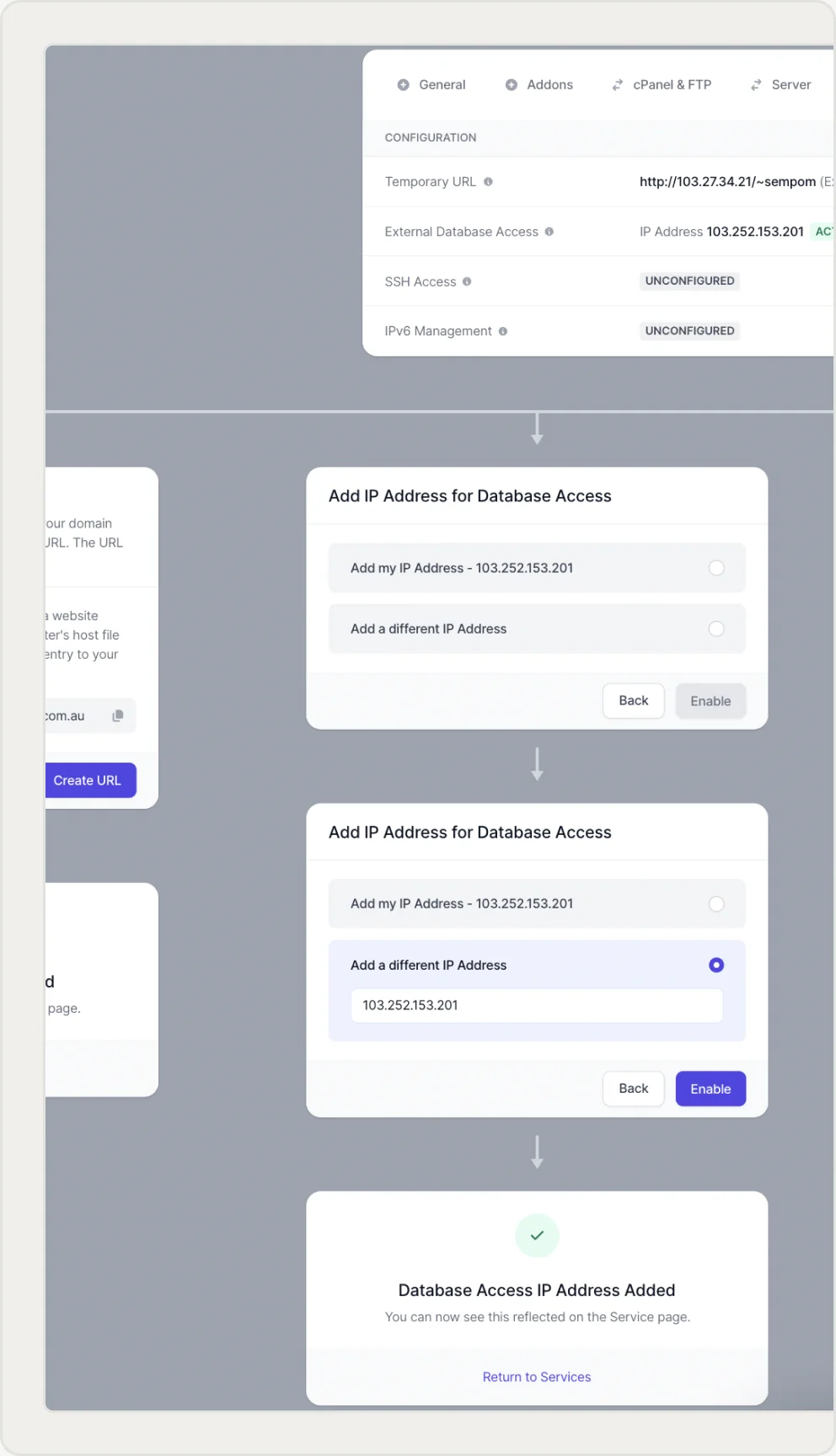
Mapping Out The Journey
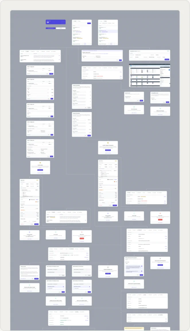
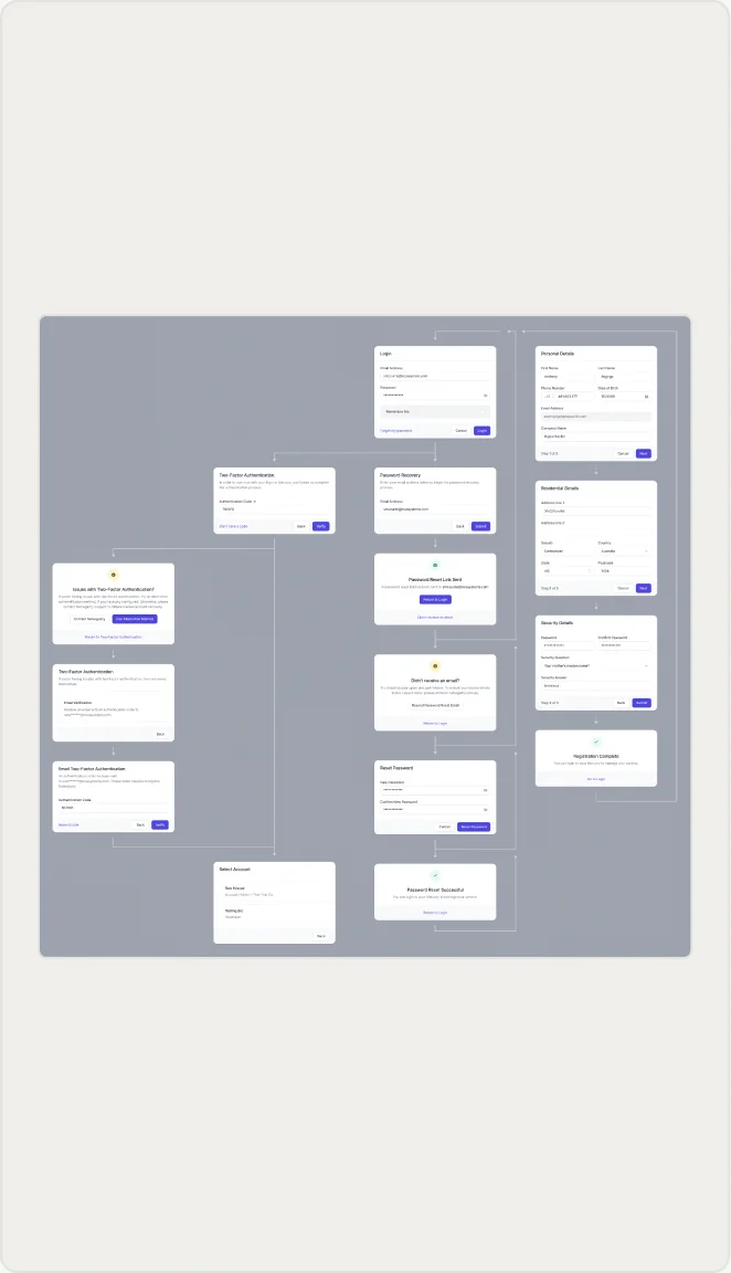
User flow diagrams were created to assist the Product and Engineering teams to understand all of the paths a user could take in completing any particular task.
Mobile-Ready
New Viewport, Same Experience
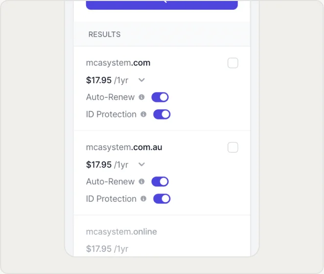
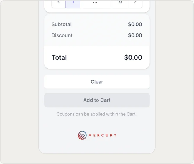
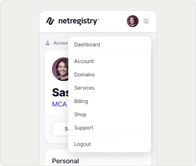
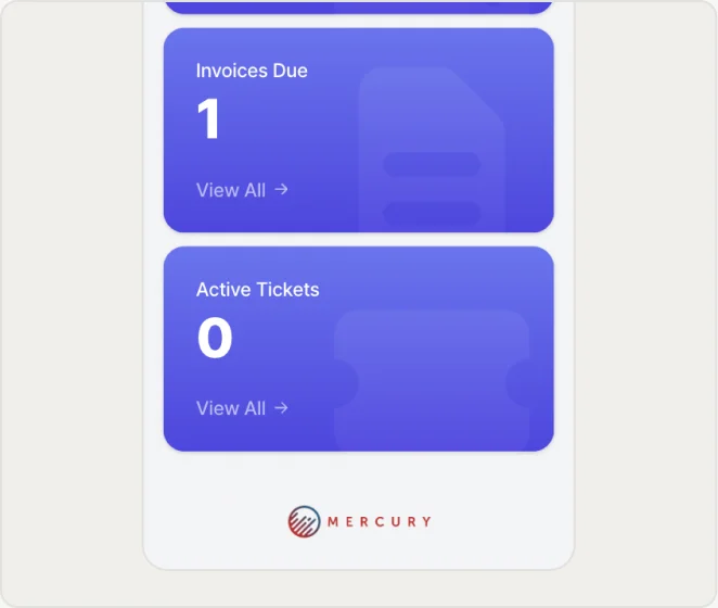
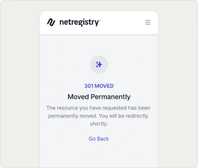
Mercury was to be a fully-responsive web app, with breakpoints across desktop, tablet and mobile, which was easily done with auto-layout componentry.

Colour Schemes
Multi-Brand Scalability
Without this system, supporting multiple brands would have meant building numerous versions of every component, with one hardcoded set per reseller, multiplying with each new brand onboarded. Instead, each component was built once, with colour resolved entirely by which Mode was active.
Outcome
One SaaS, Scaled To Unlimited Brands
The token architecture meant every new reseller brand was a configuration exercise, not a rebuild. Synergy Wholesale, Netregistry, and further brands shipped on the same underlying component set. Resellers reported a sense of ownership over the final product, evidence that one well-structured system could carry personalised colour schemes without diluting overall usability.
19 days
First-100-Customers Milestone
Learnings
1
A spike in support tickets post-launch led to user feedback sessions, where it was found that the issues centred around Service and Billing ambiguities. The fix was a dedicated FAQ module with detailed documentation.
2
Systemising the brand-theming layer before the second and third resellers arrived meant every additional brand was a configuration change, not new design debt.
Future Planning
Growing the reseller customisation scope by extending token coverage beyond colour to component-level customisation, i.e. font formatting, language, layout options.