AI-Ready Design System
Consolidating and Defining a Governed Visual System
Role
Lead Product Designer
Timeframe
6 months
Impact
QA Time for Visual Inconsistencies
Product Development Speed
Team
Product Manager
Project Manager
Business Analyst
Front-End Engineers
Back-End Engineers
Problem
Familiar Actions, Relearned Every Screen
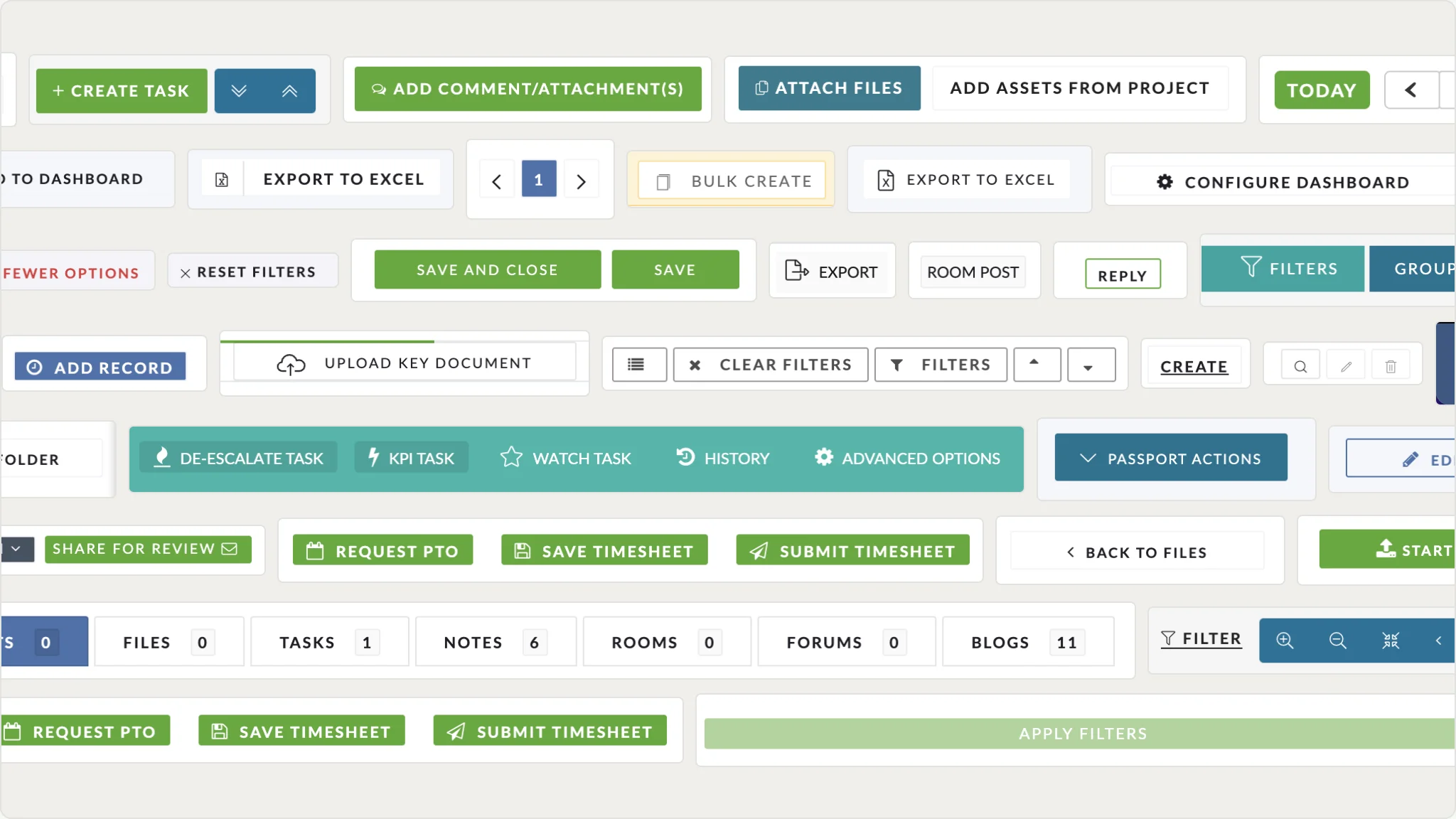
The same action looked and behaved differently depending on which screen you were on, so users were relearning tasks as they moved through the platform. It surfaced as bug reports and support tickets themed around visual mismatch and technical misalignment. Underneath was years of incremental development with no shared foundation between design and engineering.
Discovery
Cataloguing Discrepancies
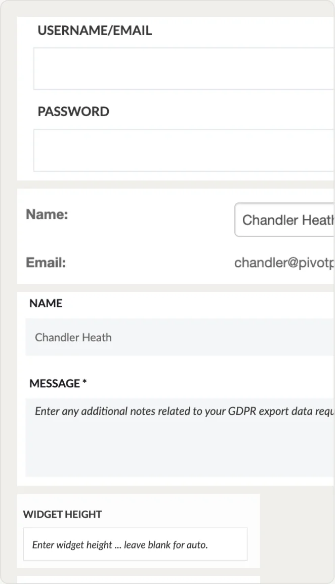
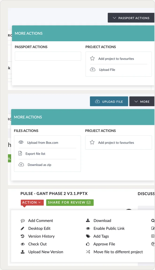
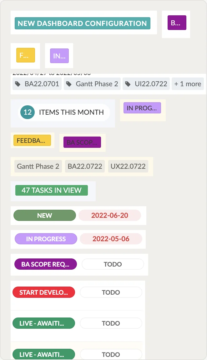
I catalogued every duplicated pattern across the platform: colour values, spacing units, component variants. Alongside that I ran working sessions with the front-end engineers and Product on which components they avoided, where they had built workarounds instead of raising a ticket, and which areas felt fragile to touch. That is what shaped prioritisation.
Define
The Middle Path, Not the Full Rebuild
A full rebuild would not fit the six-month runway, and the PM pushed back on a system-wide clean-up competing with roadmap delivery. I proposed a middle path: upgrade the highest-traffic screens inside the deadline, defer the complex workflows to a dated follow-up so they could not drift indefinitely, and codify the standard as we went.
Constraints
Timeframe
Six months, with a platform rename and rebrand running concurrently via an external agency.
Resources
One engineering squad, shared with other critical features across the platform.
Stakeholders
Management was committed to a full-scale redesign, setting the expectation for clients.
Course of Action
1
Prioritise
Ranked screens by traffic and by the engineering cost to change them. Highest traffic + lowest risk.
2
Consolidate
Reduced duplicate patterns before codifying anything, so the system captured a clean baseline.
3
Constrain
Only necessary code changed, jointly scoped with engineering. CSS aligned to the rebrand.
4
Codify
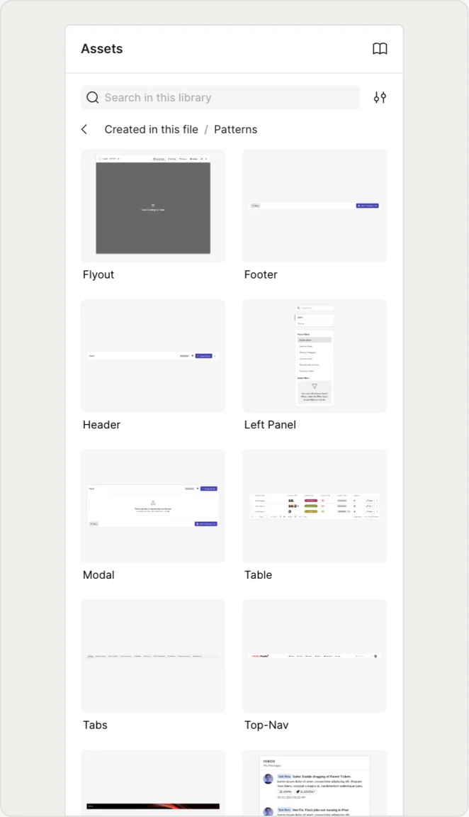
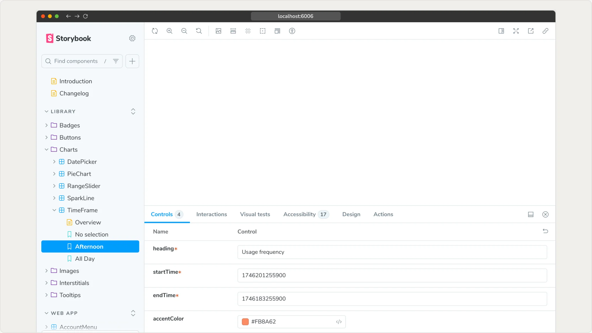
New standards captured in Figma and Storybook as the reference for everything that followed.
UI Cleanup
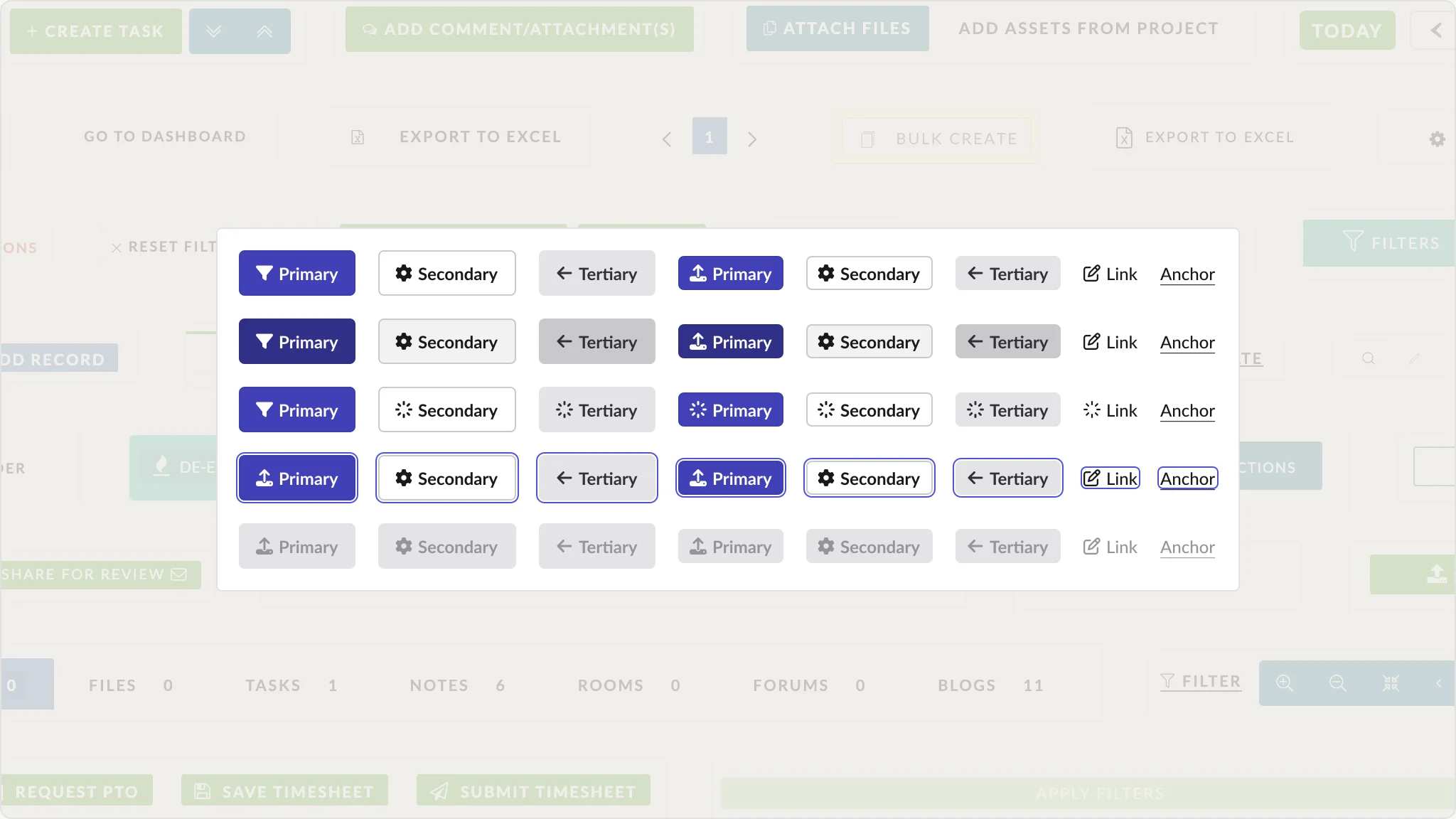
Twenty-Two Buttons Became Five
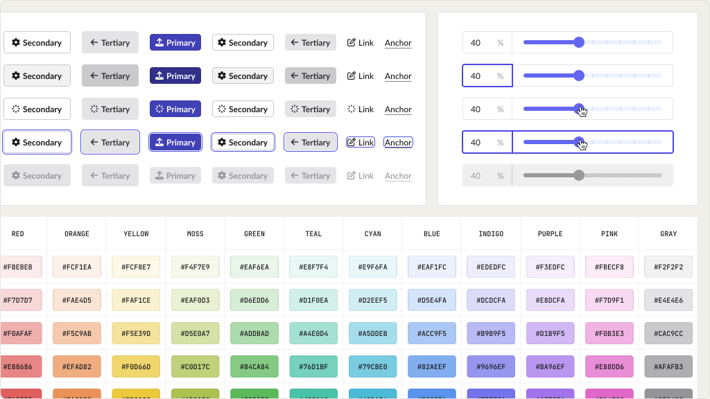
Building tokens on top of 22 divergent button variants would have frozen the inconsistency into the system, so consolidation came first. Five variants, primary through anchor, covered every state the product actually needed. Each retired variant was mapped to its replacement before anything was swapped, so engineering changed values rather than rewrote behaviour.
Token Architecture
Two Layers, One Source of Truth
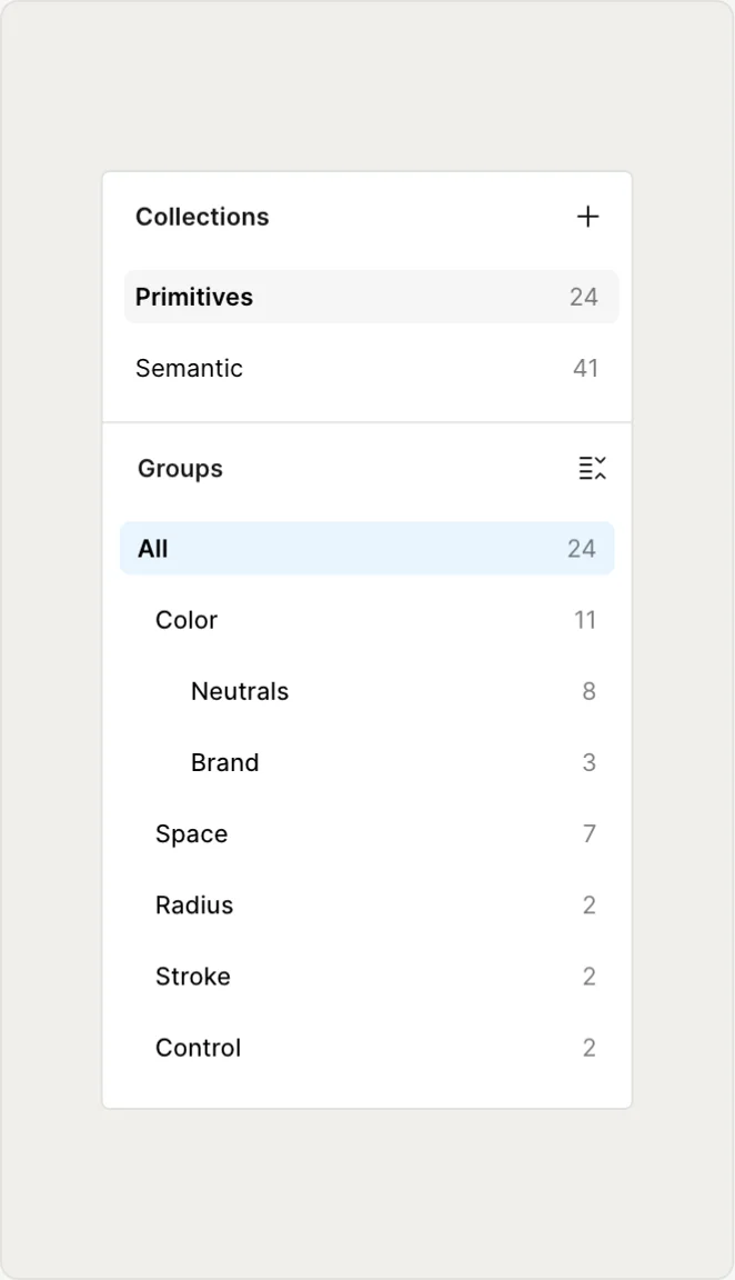
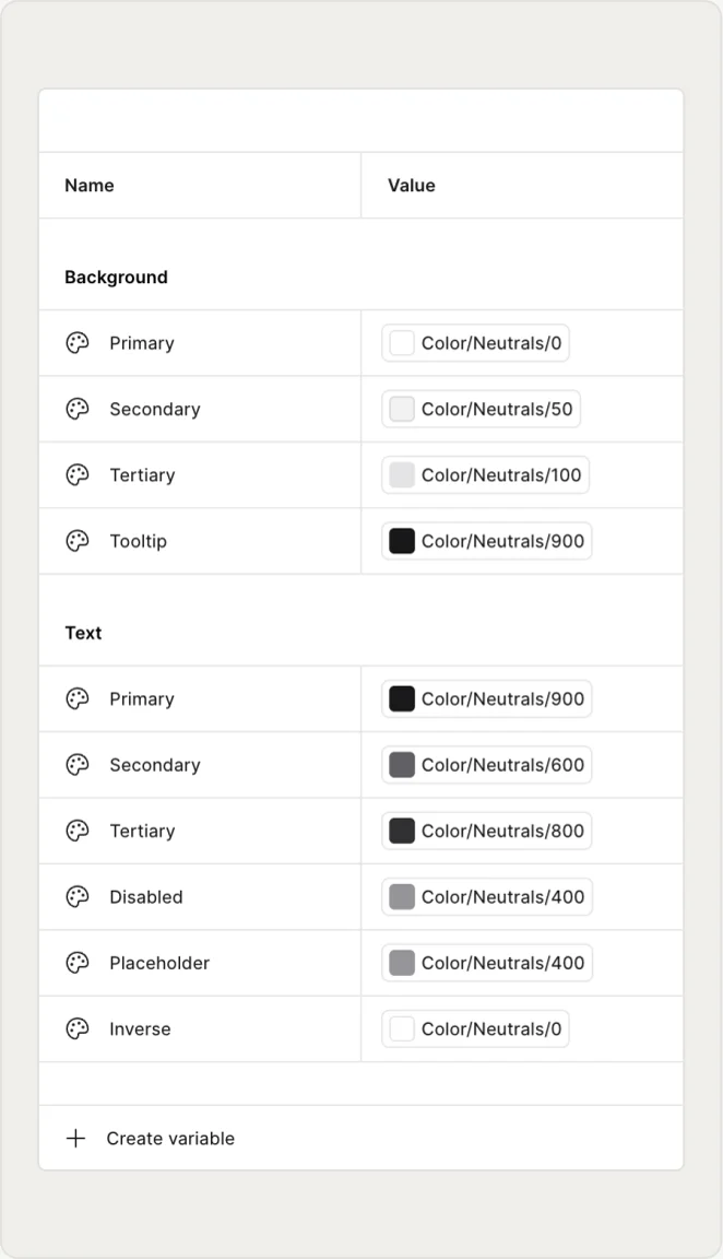
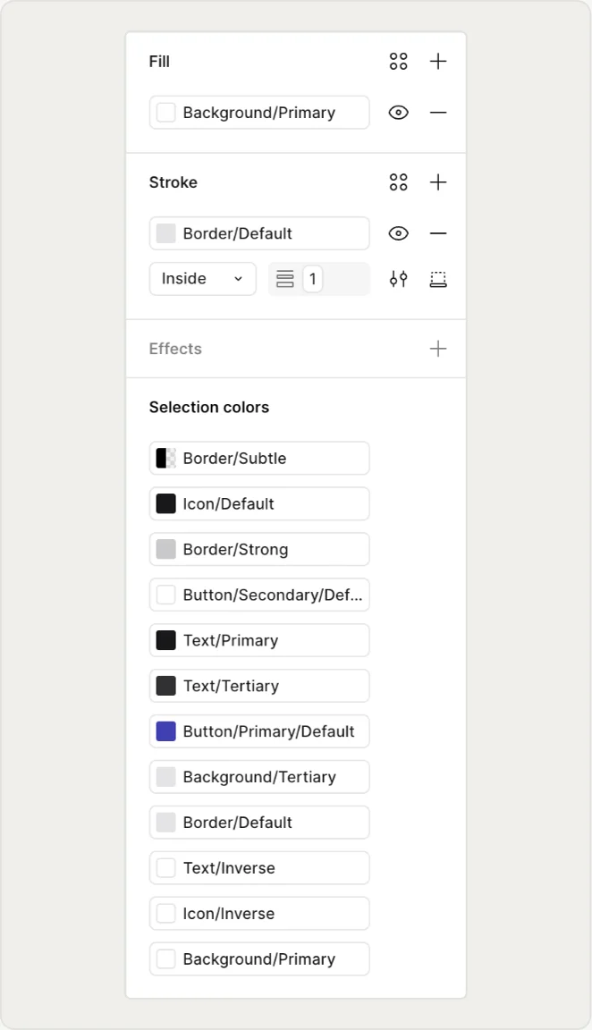
Primitives hold raw values, semantics hold decisions. Background/Primary points at Color/Neutrals/0, so a rebrand changes one primitive and every surface follows. Engineering co-defined the naming convention and the governance model rather than receiving them, with Figma Variables as the design source and Storybook as the implementation spec.
Visual Language
Calm at High Density
Density is the real constraint in this product, so the visual system has to do the work that decoration cannot. One type scale carries all hierarchy. Eight neutral steps build structure and three brand steps are reserved for action, which is what keeps a dense screen readable. Space, radius, stroke and control tokens set a repeating rhythm across every layout.
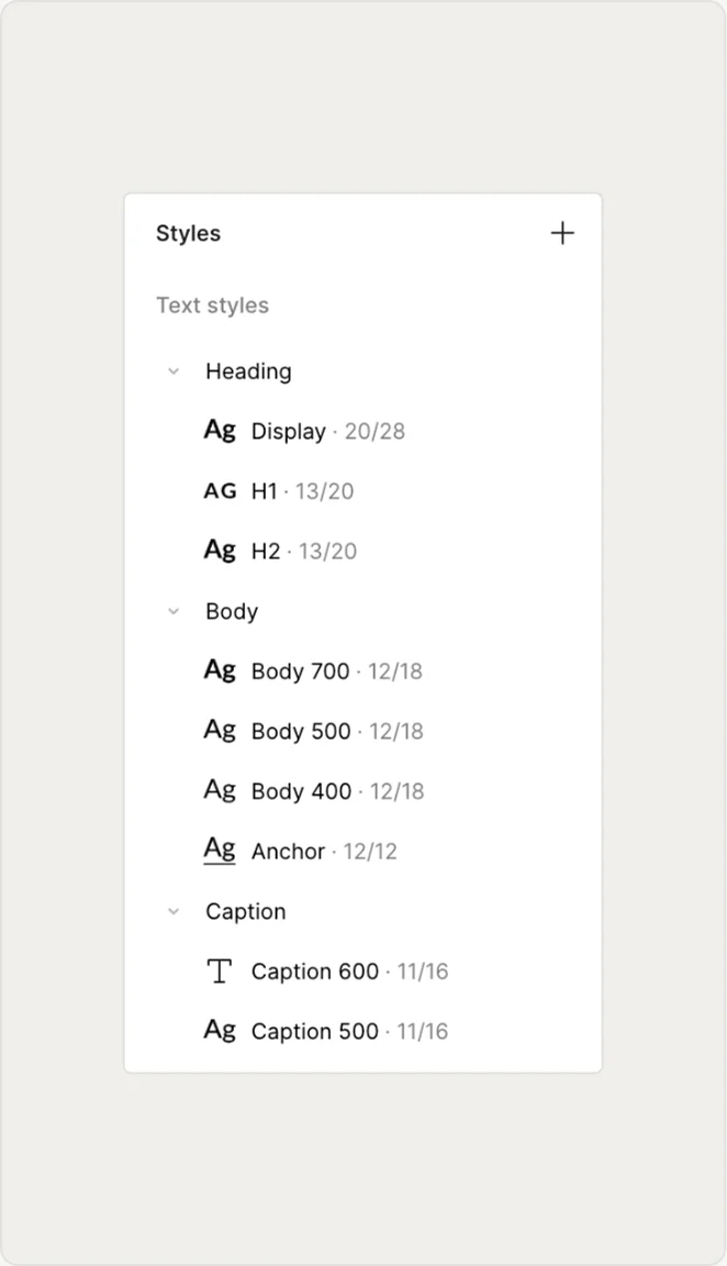
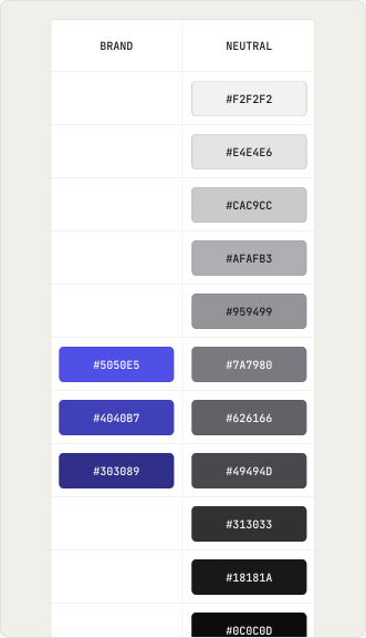
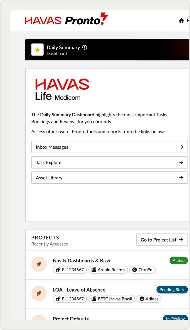
Codification
Change Without Drift
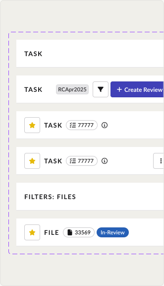
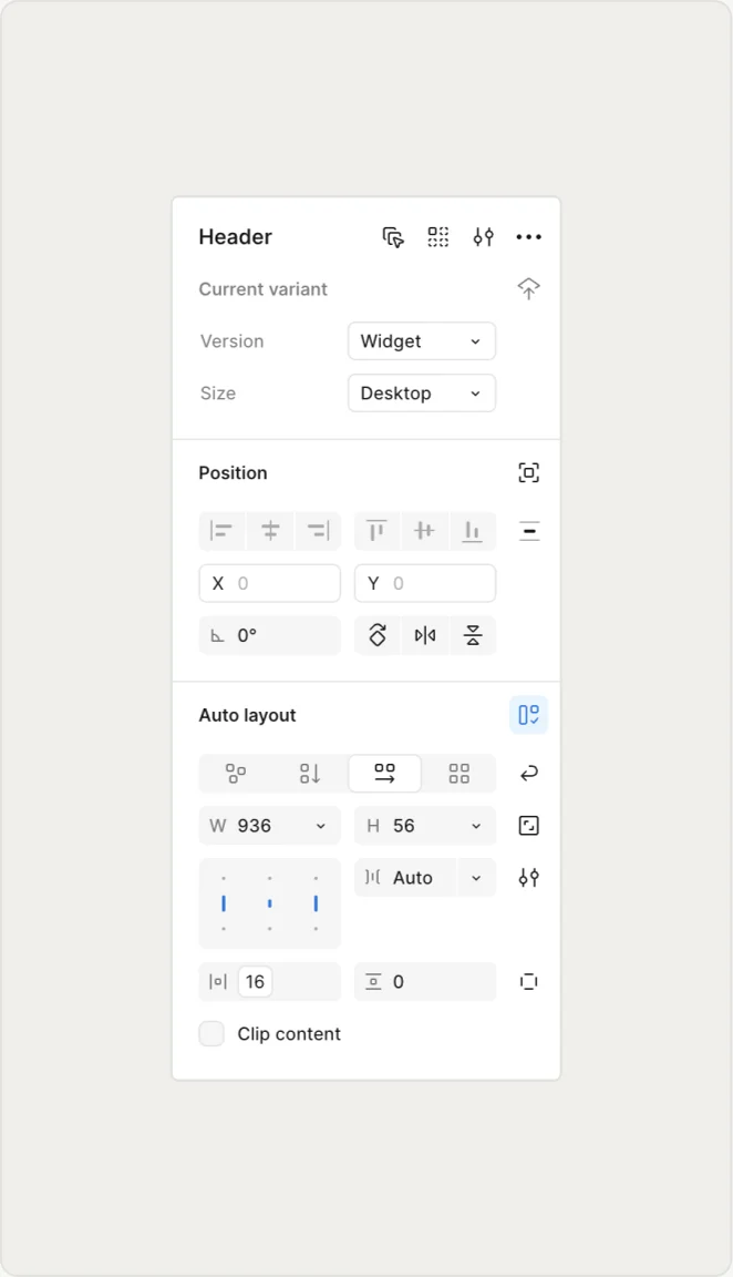
The library was published with variant controls, so the fastest route to a new pattern was always an existing component. Anything genuinely new needed a full state set, documentation and a named owner before publishing. Contrast was encoded in the semantic pairs, and focus states and target sizes were defined in the components themselves.
Adoption
Handing Over the Keys
I ran training sessions for Product and Engineering on the new standards. Documentation and working examples meant the team could self-produce on-pattern concepts, and Figma Make prompt templates linked directly to the component library kept that output on-system. I presented the system to leadership so adoption was a decision rather than a request.
Final Design
The System, Applied
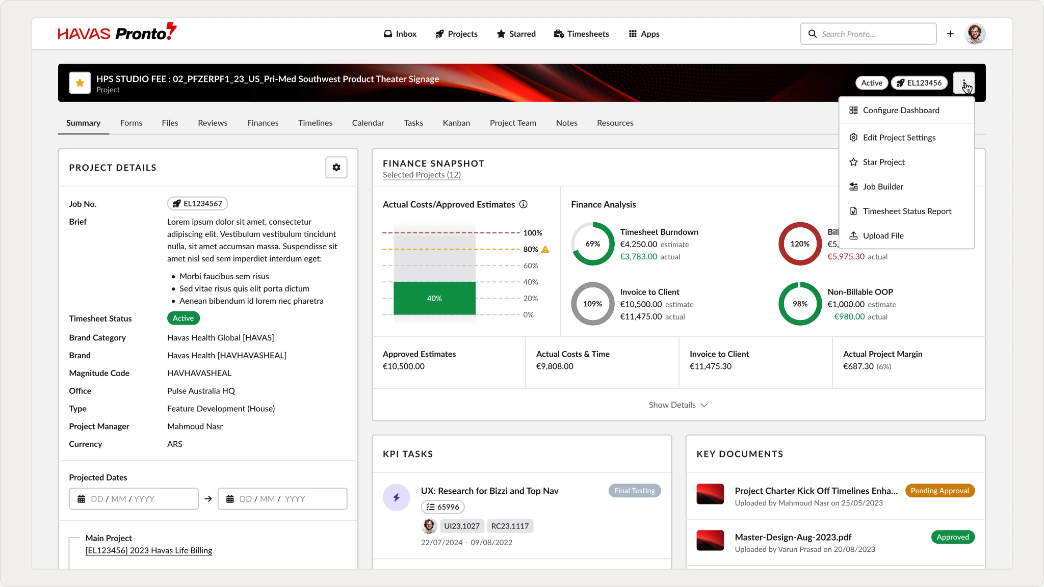
The token set and component library above are the mechanism. Here's what they produce in a live product screen — Project Wizard's summary view, built entirely from published components with zero one-off styling.
Outcome
From Drift to Shared Truth
The system stopped being a source of inconsistency and became something Product and Engineering could work from without designer guidance. Token-based handoff replaced annotation-heavy specs, new features no longer needed debt remediation before shipping, and the refreshed priority modules landed on time.
↓40%
QA Time for Visual Inconsistencies
↑30%
Product Development Speed
Measured as a before and after comparison across releases either side of adoption.
Learnings
1
Cataloguing every inconsistency before building anything took longer upfront, but it meant governance decisions were based on the full scope of the problem rather than the first few duplicates anyone noticed.
2
The system stuck because engineering helped define the token structure. Involving them at the architecture stage, not the implementation stage, is what made adoption real.
What I Would Do Differently
I proved the value after the fact. I would instrument component usage and QA volume from day one, so the case makes itself continuously instead of in a retrospective.
Future Planning
Extending token coverage to native components, and automated visual-regression checks against the token library so drift gets caught before it reaches QA.